If you’ve been following along, you know that P and V and the Ice Pop Bath has already been on a little journey of its own. The newest step? A refreshed cover design that FINALLY feels like the perfect fit.
When I first began this project, the working title was P and V and the Popsicle Bath. It had the playful attitude I wanted, but there was one snag: “Popsicle” is actually a trademarked name. That meant I couldn’t use it as the title of my book, no matter how fun it sounded. (Thanks, Dani Glazer, for helping me think through this!)
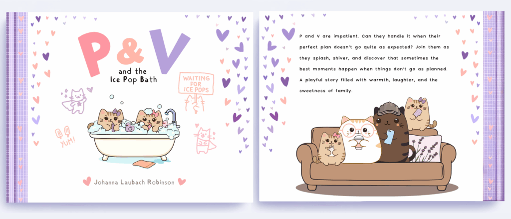
After some experimenting, I landed on Ice Pop. It’s colorful, recognizable, and just as whimsical as the story itself. And then I realized something that made me love it even more:
“Pop” can also mean Dad.
Since the heart of this story is Daddy Cat stepping into a hero role, the title now carries a hidden layer of meaning. The “Ice Pop Bath” isn’t just a silly childhood adventure. It’s also a nod to the dad who makes the adventure possible.
Then, with perfect timing, Karen Kilpatrick offered book cover feedback through her Instagram channel. (Thank you!) She asked great questions about whether the characters have more than one expression, and about what the book is really about that helped me see that the cover could show more of what’s inside.
The new does a better job. Sweet colors, playful details, and a wink at both the literal ice pops and the dad who comes to the rescue. Sometimes creative projects work out that way. A title change might feel like a setback, but gives you a moment to step back and look at it with fresh eyes. And make it better.